Meet the Maker: Claudy Jongstra
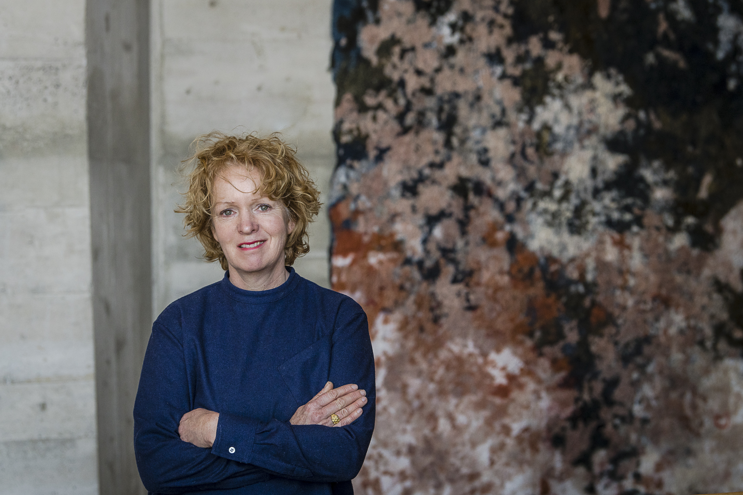
Claudy Jongstra is a Dutch artist who is celebrated for her woolen works, pushing the boundaries of natural fiber arts with innovative and ecologically-driven textile works that merge tradition with modernity. At the heart of her work is a commitment to ecological justice, regenerative agriculture, and material integrity, evidenced by her biodynamic farm that nurtures Drenthe Heath sheep and heirloom dye plants.
Jongstra’s pieces, known for their tactile warmth and ecological depth, have graced public institutions and the walls of private homes alike, transforming spaces into reflections of nature’s resilience and the artistry of centuries-old techniques. Our Luxe Urban Expansion project features a custom commission of her work in the primary bedroom.
Tell us about the beginnings of your practice. How did you get started in the textile arts?
Early in my career, I saw an exhibition on wool felt; at the time, I was working in fashion. It included incredible, traditional yurts – shelters that have housed nomadic people for centuries – made entirely of wool. Seeing wool felt used in this way, to shelter and protect, and the generations of Indigenous knowledge connected to that, had such an impact on me that I immediately quit my fashion job and started working with wool from that moment on. I locked myself in my atelier in Amsterdam and dedicated two years to becoming completely familiar with this material and technique, making swatches and samples that combined many different materials with wool. After two years, I showed my collection of samples to a conservator at a museum. She said she had never seen contemporary wool felt like this and immediately purchased several pieces for the museum’s collection. At that point, I knew I made the right decision: quitting my job and exploring wool.
I got my first major commission around the same time, on a trip to London. I was showing my work at the Royal Opera House when I was serendipitously introduced to the costume designer for Star Wars, who immediately asked me if I could work on the long-coats for the Jedi warriors.
What are some overarching themes and/or motifs that appear throughout your body of work?
My work always advocates for ecological justice and regenerative, biodiverse agriculture. Coming from a background in fashion design, particularly at a time when ‘fast fashion’ was accelerating, I became so aware of the immense waste of materials. I attribute this to a lack of connection with our materials and their sources. I think if you feel connected to a material, then you value and respect it. This is a concept I continue to explore in my work – my own curiosity and connection with materials, as well as how to inspire others to feel curious and connected to materials, to their environment, their communities, and maybe to take better care of them as a result.
This is one of the reasons that education is so important to my practice. Techniques like spinning and plant-based dyeing depend on non-verbal, tacit knowledge passed down through the hands of generations of makers. Teaching these techniques and using them in my work is one way I ensure this ancient knowledge and expertise is passed down to the next generation.
Who are your biggest artistic influences?
My partner Claudia, who has so brilliantly grown our farm in Húns into an inspirational oasis of biodiversity amid Friesland’s green fields of monoculture, and Chef Dan Barber, who has transformed the way people think about food and farming through his revolutionary, farm-to-table Blue Hill restaurants in Manhattan and at the Stone Barns Center for Food and Agriculture.
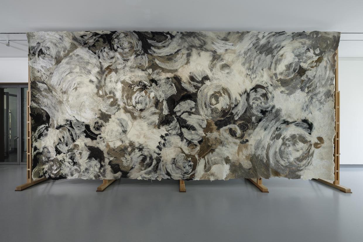
In 2021, I was inspired by Pablo Picasso’s monumental ‘Guernica’ painting, which he painted and exhibited in 1937 as an indictment against the violence and devastation of the Spanish Civil War. I created ‘Guernica de la Ecología’ with the same dimensions and neutral, achromatic colour palette to express the violence and devastation of our ecosystem in the face of climate change and intensive monoculture. The lack of colour in this floral composition depicts a world where biodiversity and colour have been stripped from the landscape. The piece follows the nomadic model of ‘Guernica,’ with international exhibitions alongside key cultural and political events that generated transdisciplinary dialogue and action.
How do you source your materials?
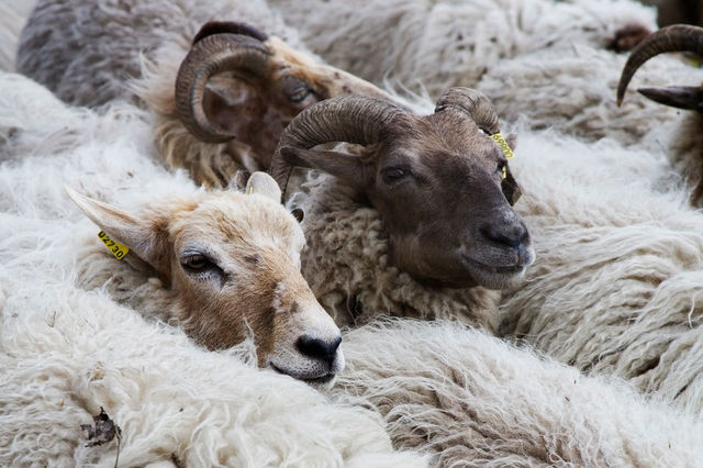
It’s very important that I know where the materials I work with come from. Taking this even further, caring for the sources of my materials has become an integral part of my art practice. We source the highest quality wool from our flock of 250 rare Drenthe Heath sheep, whose soft wool reflects their quality of life and the care taken to provide them with a healthy lifestyle, a nutrient-rich diet free of antibiotics, and a biodiverse habitat. Our Drenthe Heath sheep live on a protected natural reserve (‘It Fryske Gea) in their native heathland habitat in the Dutch province of Drenthe, under the care of shepherd Ko Maring.
Recently making a comeback from the brink of extinction, Drenthe Heath sheep play a vital role in the conservation of the heath landscape, particularly in the face of climate change. The sheep maintain the balance between diverse biotopes by grazing and carrying the seeds for future heathlands in their wool fleeces, scattering them as they roam.
We take the same care in growing the dye plants for our natural colours. We began with a modest dyers’ collection garden beside our natural dye lab and quickly discovered that the quality far surpassed the natural pigments available for purchase. The vibrancy and clarity of the plant-based colours in my artworks reflect the quality of the soil on our biodynamic farm, where we have expanded this collection to grow a diverse variety of heirloom and historic dye plants harvested seasonally to create fresh, saturated, plant-based colours. Now, we also work with biodynamic farmers across the Netherlands, Spain, Belgium, and the United Kingdom to expand the cultivation of natural dye plants on a gentle scale.
What is your favorite part of working with natural fibers?
Working with Drenthe Heath sheep’s wool, the artworks are completely connected to the health of the ecosystem that supports them. The resilience and strength of the Drenthe Heath sheep wool I work with is completely dependent on the holistic wellbeing of the sheep – impacted by everything from the minerals in the soil, growing nutrient-rich plants for them to graze on, to responsible shearing practices that prevent stress and injury to the sheep. So, working with natural fibres serves as a constant reminder of this interconnectivity and always lends the most beautiful warmth and tactility to my artworks.
Can you walk us through your design process, from concept to completion, for a custom piece?
For a custom artwork, the design process always starts with the location – so that we can connect the space to its surrounding environment through the artwork. We often shape the colour palette for custom pieces around plants that are native to the region, using these plants as natural dyes. How the space will be used, and the role the artwork will play in that use – with the ability to contribute aesthetic, acoustic, and health-beneficial qualities to spaces – is another essential part of the context that we incorporate into the design of each piece.
Conceptually grounding each artwork in this context, we create a palette of 100% natural fibres in a range of plant-based colours and a felted wool sample that incorporates this palette in an artistic composition that will serve as the inspiration for the creation of the artwork.
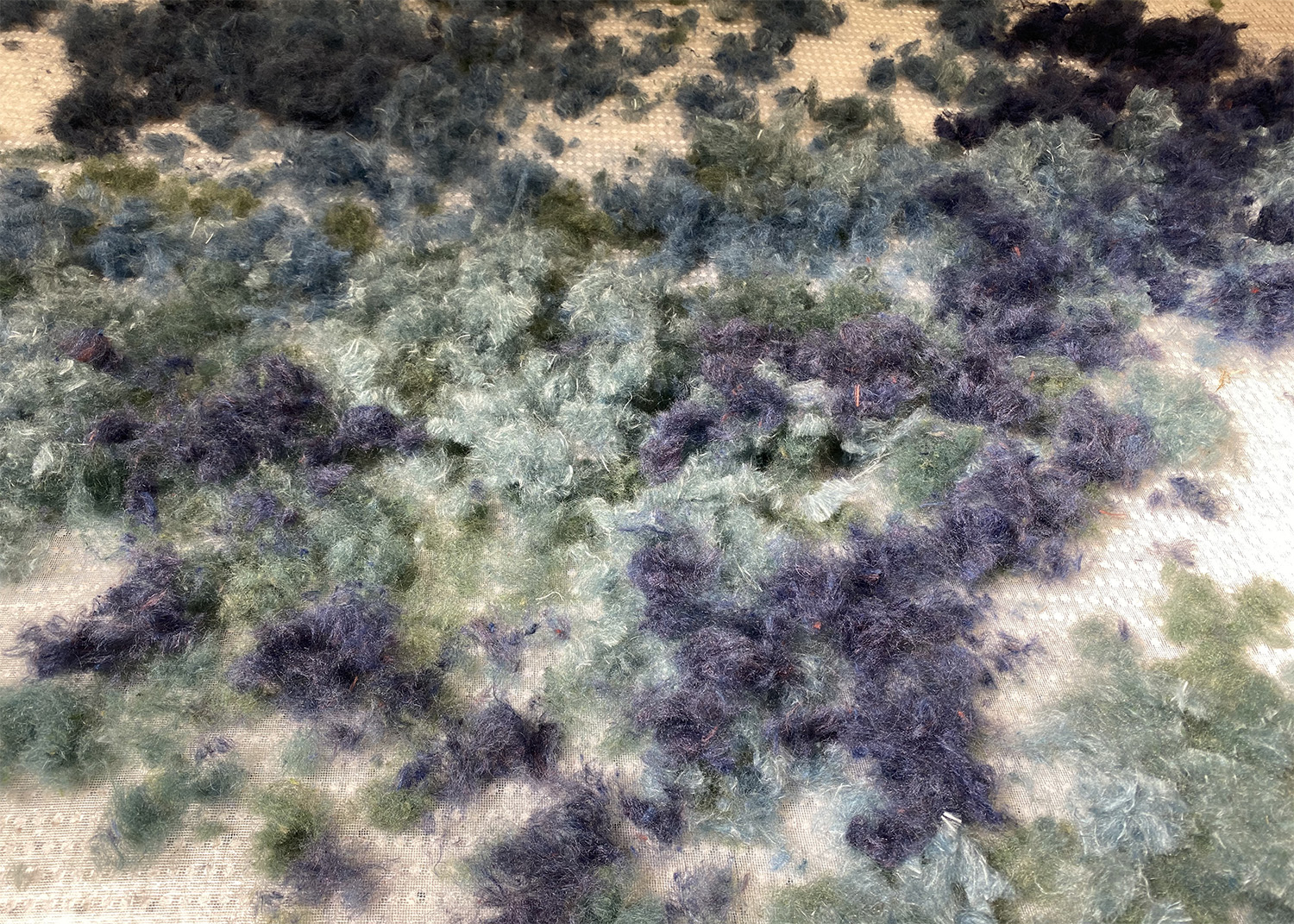
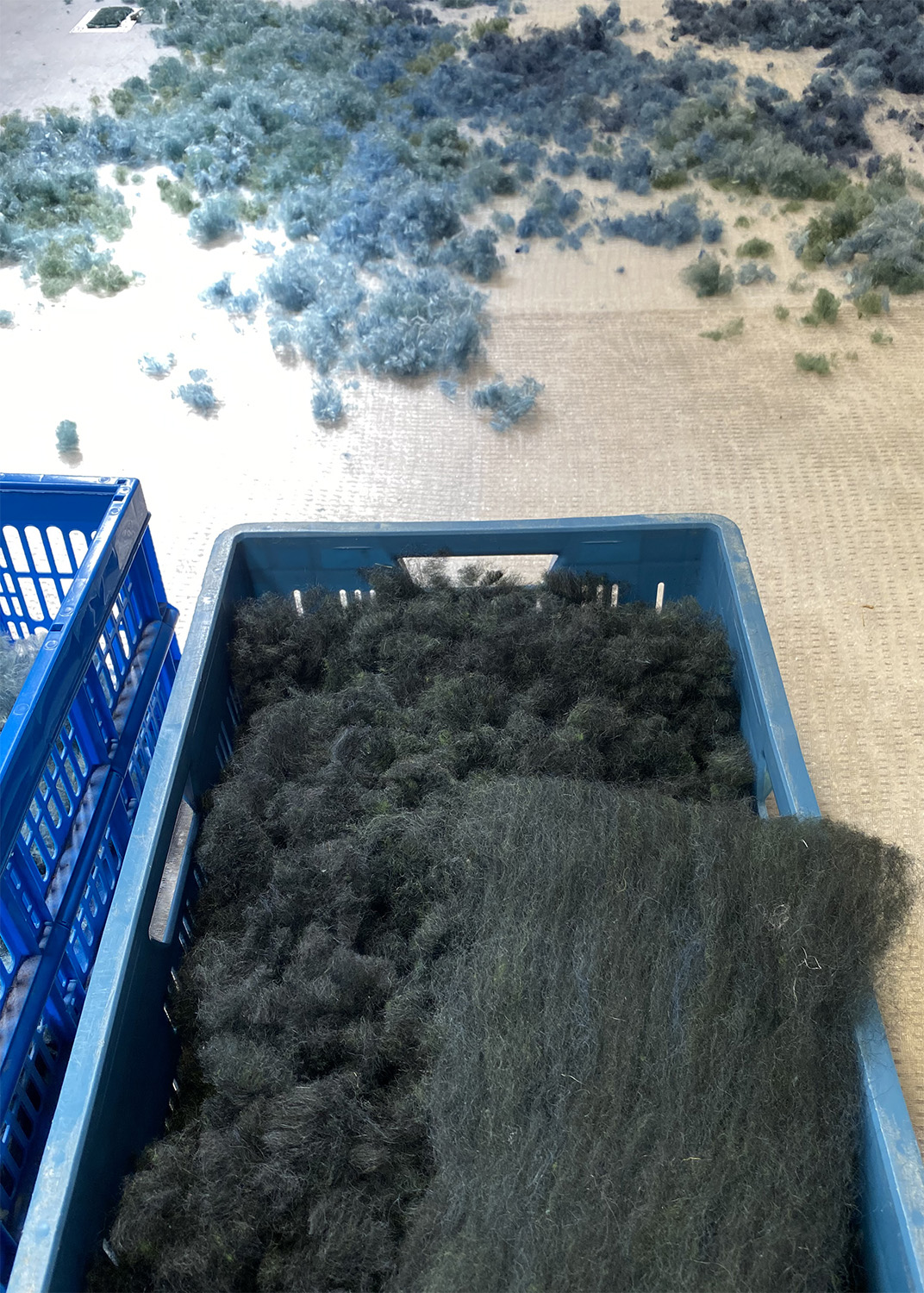
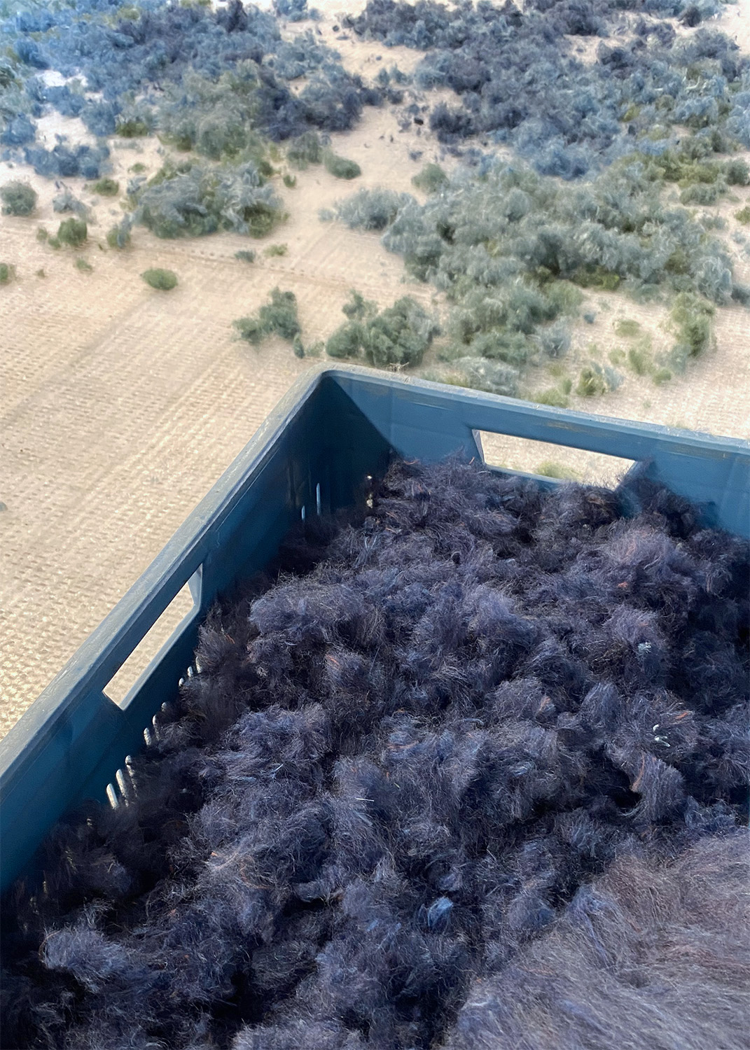
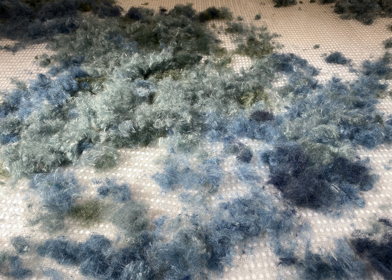
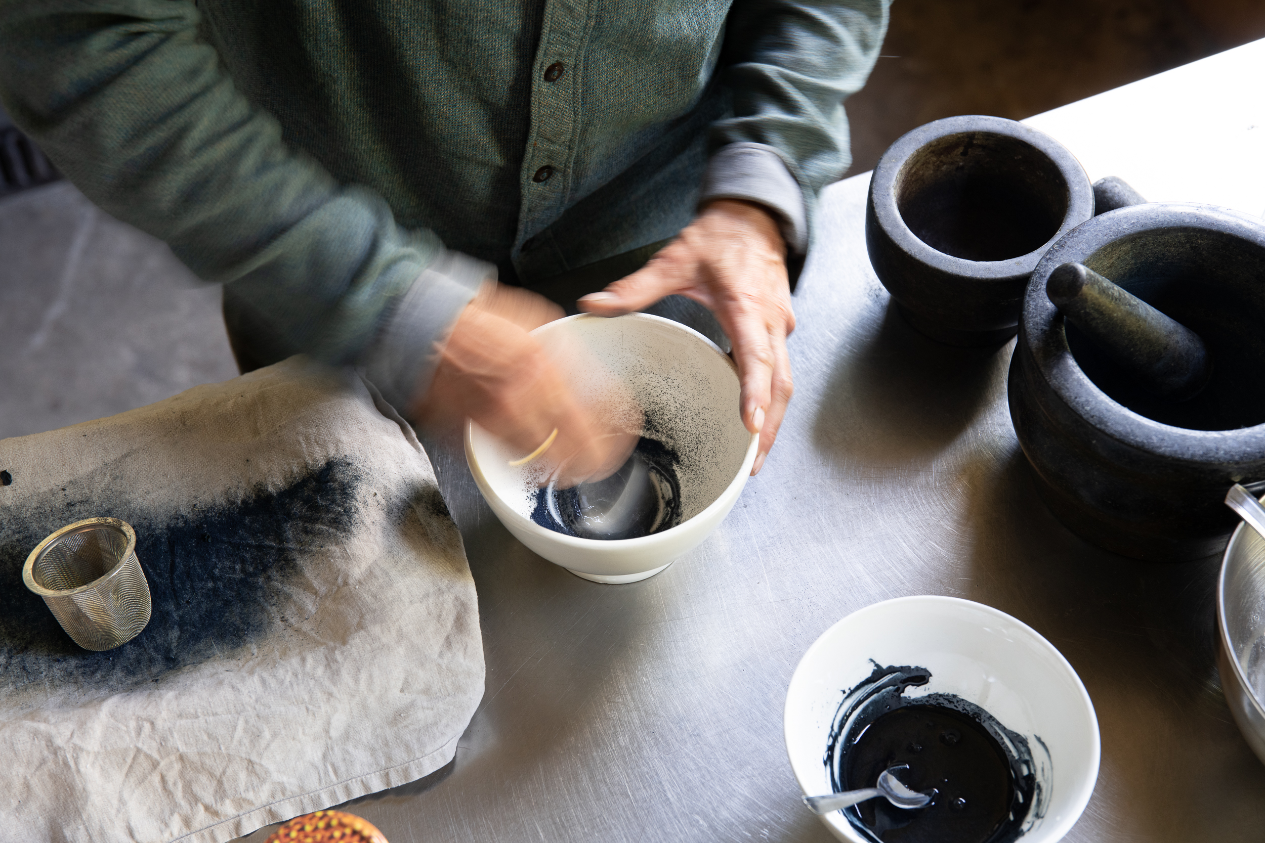
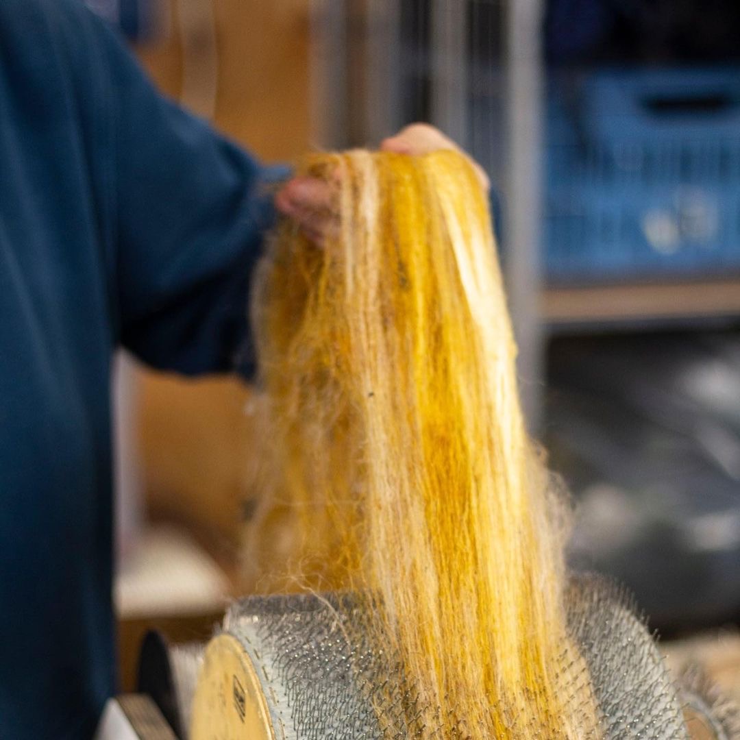
The process of creating an artwork begins with washing and dyeing our signature Drenthe Heath wool and organic silks with plant-based colours harvested on our biodynamic farm or our partnering farms. The coloured fibres are then carded by hand – a process that combs the fibres and mixes colours. Through the carding process, we further refine the artwork palette by combining colours and fibres into unique, sophisticated blends. The resulting ‘cardings’ are like a painter’s palette, which is composed in layers and felted into a single tapestry artwork. I have worked closely with the Head of Atelier, Anneleen Reitsma, for so many years, developing these processes and creating artworks that we almost don’t need words anymore, communicating through our hands with an unspoken, shared understanding of the materials and techniques.
What are some of the biggest technical challenges you face when creating your work?
I love working on large, wall-filling pieces. To date, the largest piece I have made is the 19-foot-by-35-foot ‘Fields of Transformation’ artwork for the Van Pelt-Dietrich Library at the University of Pennsylvania in Philadelphia in collaboration with the global architecture firm Gensler. Our atelier was not large enough at the time to lay the artwork out in its entirety. So, we set up a temporary satellite atelier in a nearby school gymnasium, where we used the entire floor to lay out the artwork and hand-embroidered more than 9,000 stitches with handspun, naturally dyed yarn.
What’s the most unusual or unexpected request you’ve received?
This past spring, the landmarked International Theater Amsterdam (ITA) asked us to develop acoustic ceiling panels for the restoration of their ‘pleinfoyer’ – the historic reception hall adjacent to their large theater. The space is used for receptions during intermission as well as for private events and has posed acoustic challenges since a royal blue carpet was removed to reveal the original granito floors. We are often approached with acoustic challenges, but we had never done a ceiling before, let alone in a landmarked space. More than acoustics, the piece needed to contribute to and reference the layered history of the pleinfoyer, complimenting the restored granito floors and 1939 wall frescoes painted by Gerard Hordijk.
A 2022 research and analytical study of the layers of paint on the walls and ceiling revealed remnants of colourful, floral wall paintings dating back to 1894. The ‘botanical fresco’ we created for the ceiling returned these hidden layers of colour to the space. The ceiling panels capture the historic tones with plant-based colour from historic pigment plants, including woad (Isatis tinctoria), madder (Rubia tinctoria), and golden onion skin.
The botanical composition of the fresco for the ceiling of the Pleinfoyer pays homage to the floral motifs that covered the walls of the room in its original 1894 design. The organic composition of botanics references the time-sensitive and fluid process of fresco painting, which is so characteristic of the ITA in the pleinfoyer and throughout its magnificent halls. The plant-based colour palette is also reflected in the expression of botanics, drawing a connection to the contemporary Dutch landscape as well as the historical significance of each pigment plant for cultural heritage.
For our project, you crafted a unique textile piece for the primary bedroom. What was the collaborative process with our team like?
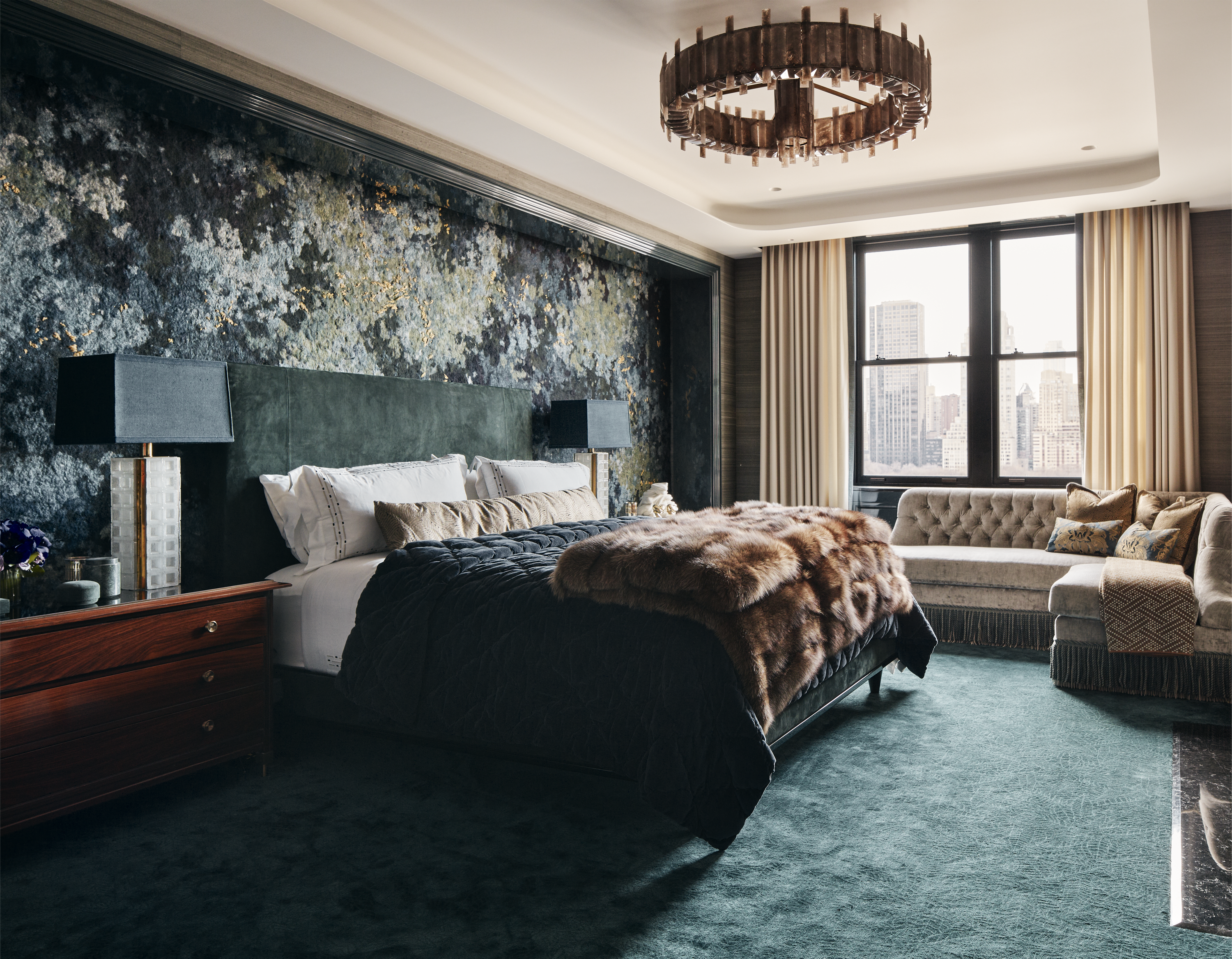
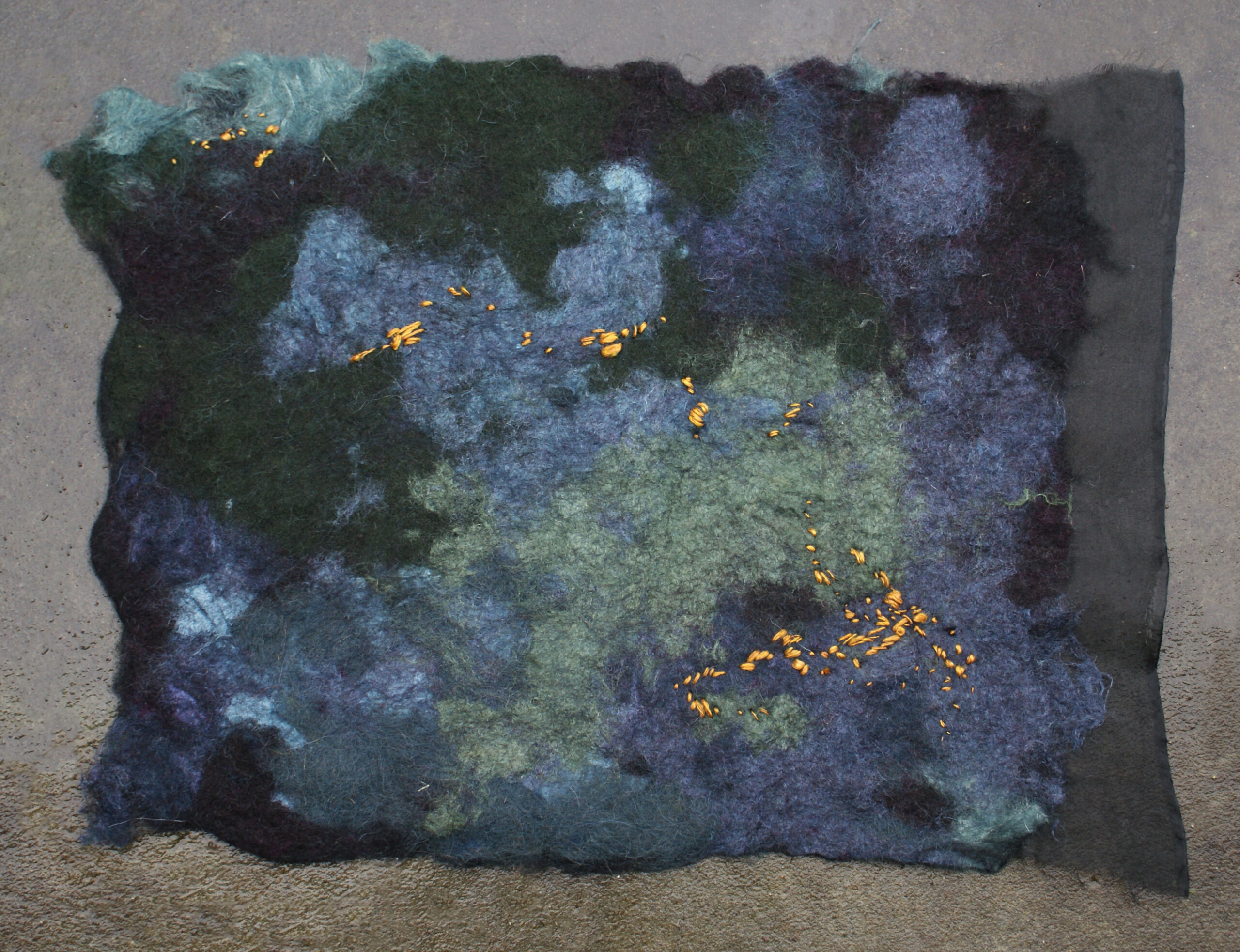
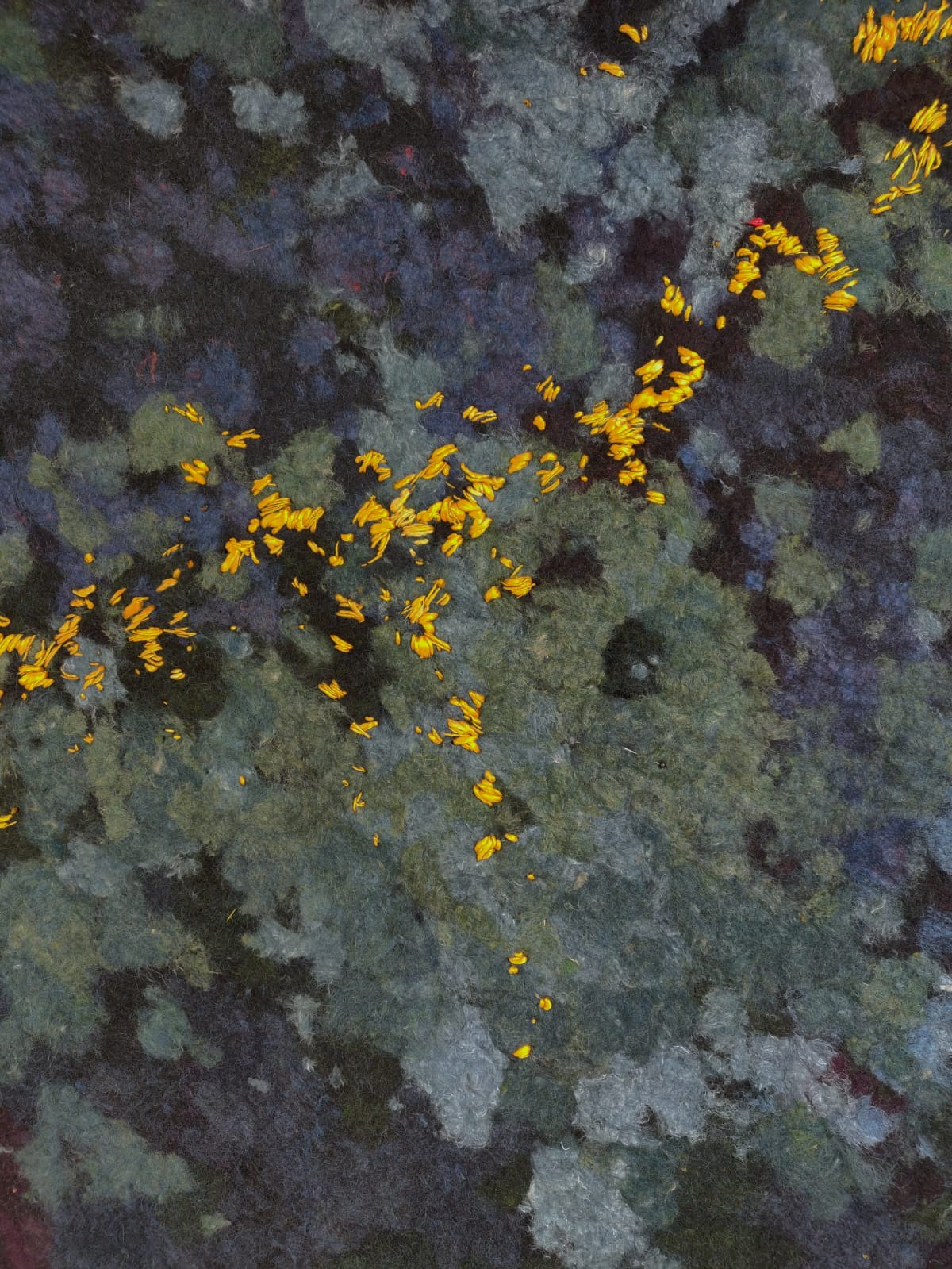
We collaborated closely with the team at Pembrooke & Ives to develop the wall-filling artwork, ‘Radiant Constellation,’ for the primary bedroom. We began by sharing initial samples with the design team. A sample with an impressionist composition of stippled wool in plant-based indigo blues, soft greens, and deep violets was selected as the inspiration for the bedroom niche wall. As the project evolved, we worked in dialogue with the design team to refine the artwork palette and composition, adding radiant golden accents of embroidery in naturally dyed, handspun, organic silk yarn. This close collaboration with the Pembrooke & Ives design team allowed us to create an artwork feature wall that harmoniously ties the design of the bedroom together.
The color palette of your piece aligns beautifully with the overall theme of the home. Did you have a vision of the space in mind when creating the wall installation? How did you select colors?
The process of developing and refining the colour palette for ‘Radiant Constellation’ took place in close collaboration with the Pembrooke & Ives design team, taking the materiality of the rest of the space, such as the carpet, into careful consideration. Working with plant-based colours and natural fibres, I am always confident that the artworks will bring a harmonious tactility, warmth, and depth into spaces. As I composed the layers and movement of the fibres in this piece, particularly while working on the hand embroidery, it was inspiring to imagine a deep night sky dotted with brilliant constellations of stars.
Can you walk us through how you achieved the rich and vibrant tones in this work?
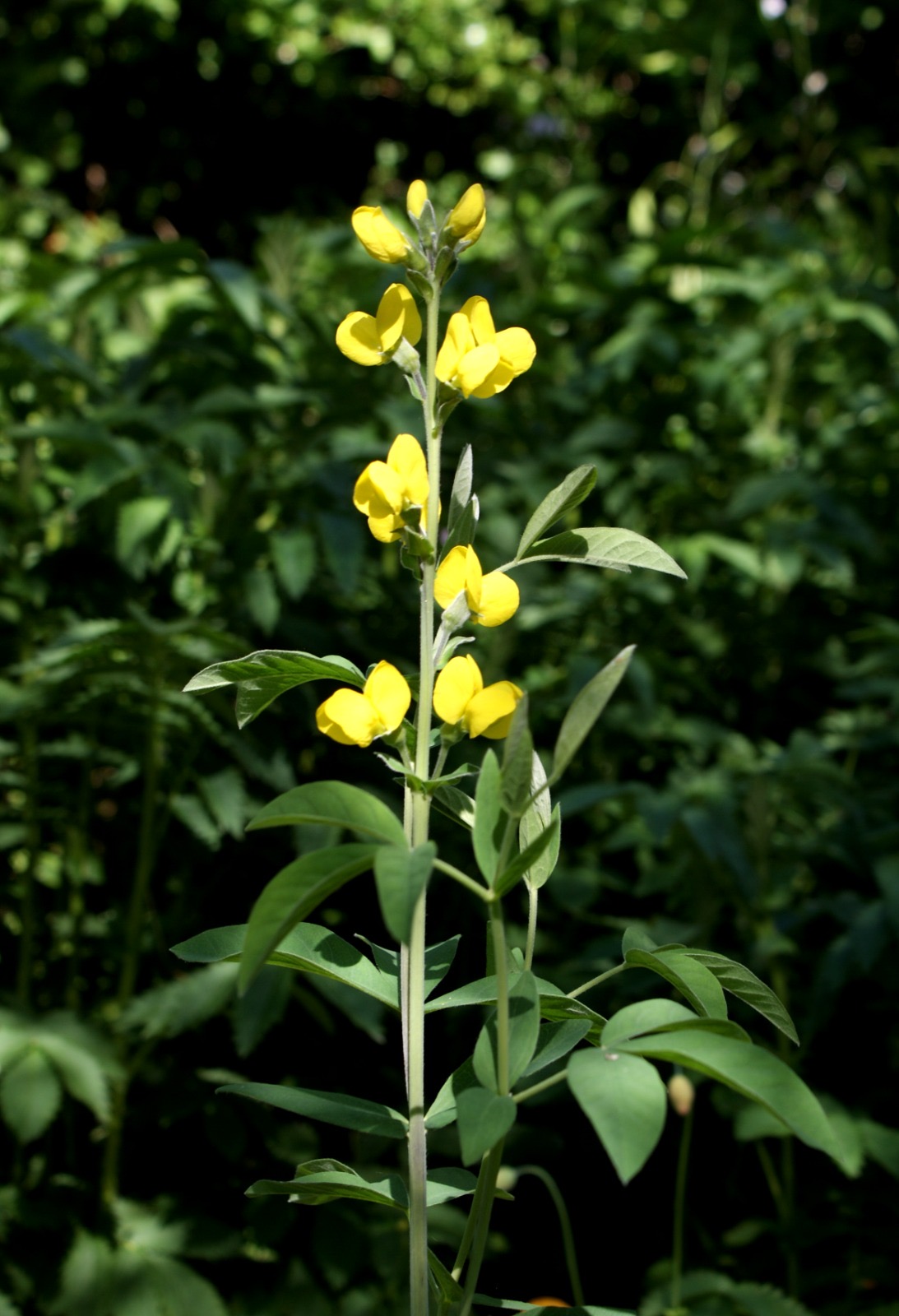
The colour palette derives entirely from plants – primarily indigo and onion skins – following ancient recipes that contain generations of tacit knowledge. The dye processes for these two plants are quite different. While golden tones are transferred onto fibres from the onion skins while cooking in a dye bath, the deep blues of indigo are achieved through oxidation once the fibres are removed from the dye bath and exposed to oxygen.
Were there any challenges or exciting breakthroughs you encountered while working on this custom project?
The technique we used to achieve the impressionist effect in this piece was a new compositional approach that we were working on at the time. After carding the fibres to create the final material palette for the artwork, we cut the cardings to shorten the fibre length. In the final piece, this resulted in the appearance of shorter ‘brush strokes’ or a more stippled composition.
How do you envision people interacting with your art in a space like this? What do you hope they feel when they experience your pieces daily?
I hope my artworks are comforting, providing a kind of natural familiarity in spaces like this while also serving as a source of curiosity and inspiration to reconnect with the natural world.
